RAKU 楽 Sushi
- Client
- RAKU Sushi, Zürich
- Year
- 2026
- Job
- Brand, packaging, storefront, operator console
- Country
- Switzerland
Project description
One idea, and nothing to sell it with. RAKU came to us with a name, a recipe and a lease — and five weeks before the doors opened.
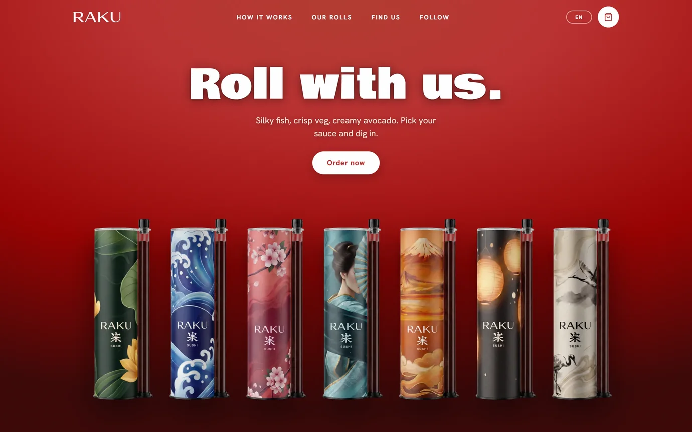
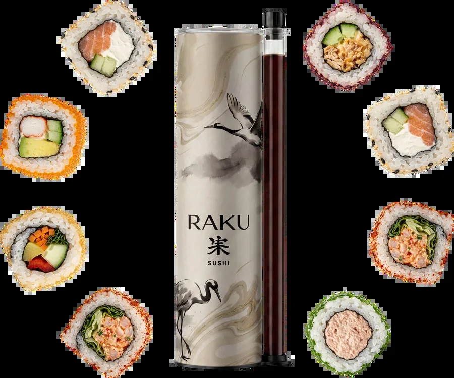
We built the identity first: a mark that works at the size of a tube label and the size of a pavement sign, seven roll designs that double as the packaging, and a colour system that tells a customer what they are holding before they read a word.
Then the software. A storefront in four languages that knows what is in the fridge and stops selling when it runs out. A kitchen screen where the whole team works from one board. And an owner console — thirty screens covering stock, staff, campaigns and what each order is actually worth.
Films
Raku Sushi - TV Spot
categoryA brief description of the project up to 150 characters in two rows.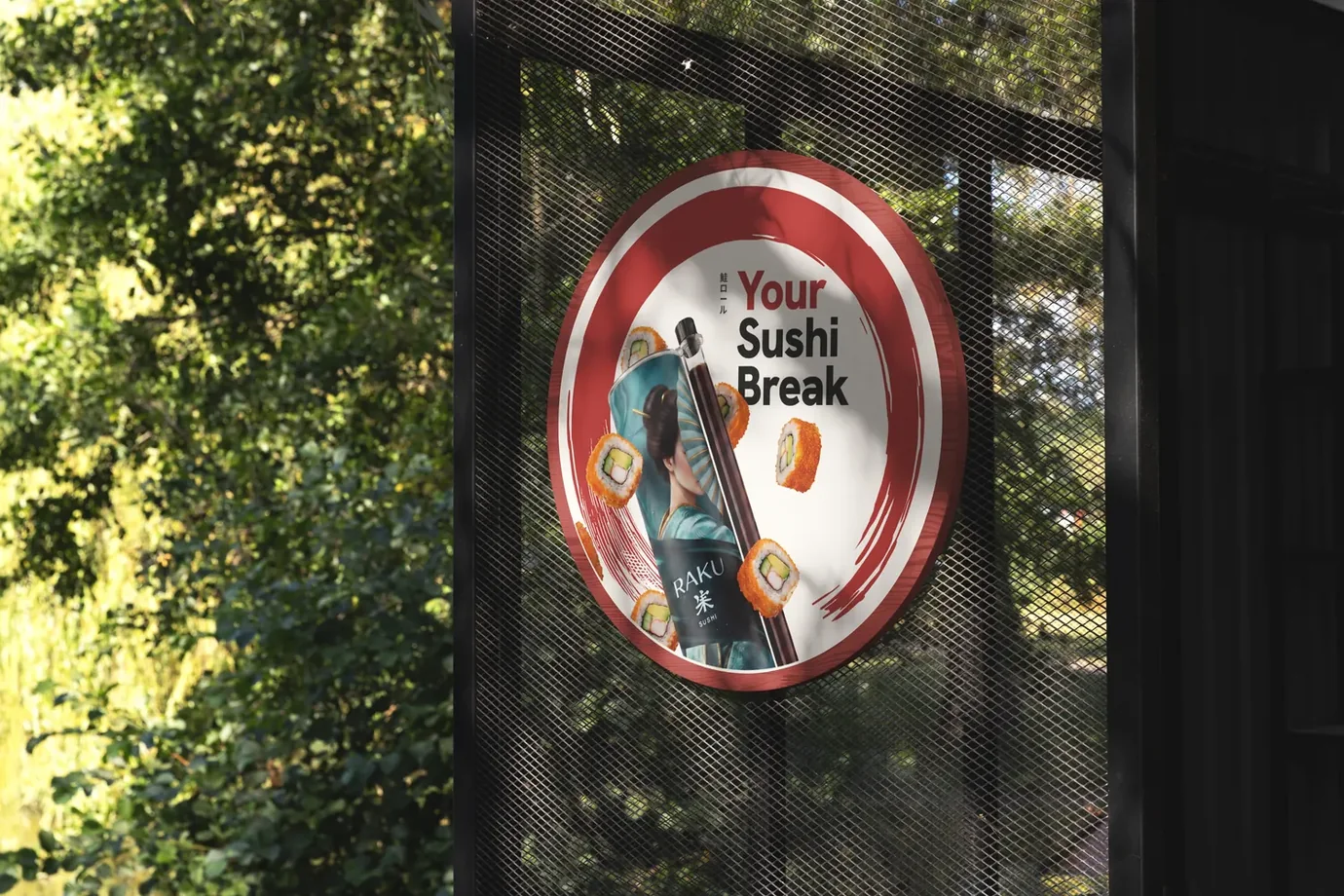 categoryA brief description of the project up to 150 characters in two rows.
 categoryA brief description of the project up to 150 characters in two rows.
 categoryA brief description of the project up to 150 characters in two rows.
Let’s Start a Project!
Prefer to talk? Book a free 20-minute call or call +41 78 200 22 78 / +44 7340 635345.